via Coastal Living
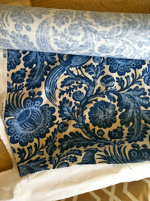
We've been making lead way in the main living spaces especially (kitchen and family room), and already have paint and fabrics chosen for these spaces. Imagine my surprise when the very first image on the CL website included an almost identical curtain fabric we're using for the family room and shares a very similar color palette!
For my mom's space, we decided to take a different route with wall color and picked up the deep blue of the fabric, juxtaposed by light furniture. Both looks are great in my book. Pretty hard to go wrong with a classic blue and white combo.
I love how designer Frank Randolph, like any good designer, mixes endless shades of blues and beiges into the space. Everything isn't perfectly matchy-matchy. A hallmark of good design, it adds more interest and has a softer effect on the eye and mind.
via Coastal Living


ha! i love it when things like that happen. The curtain for my bathroom has a similar pattern as well. I love the blue and white combo as well.
ReplyDelete:)
Caterine
730design.blogspot.com