Such a pretty holiday set-up we pulled together at a client's house on the fly.

And that Beni Ourain doesn't hurt either!
P.S. Do you see that sofa fabric in the background? #Jealous #ClientsHouseIsCoolerThanMine


 The IKEA system is wonderful. I love how easy it was to customize and create exactly the set up you're after.
 It's so nice having a space to see everything finally- I feel like my clothes have always been all over the place (and the floor). But even if you don't have a walk-in closet, you could install a set exactly like mine above along a wall of a bedroom and curtain off the whole thing. I wish I had done this in my apartment with a small closet.
 Remember that cedar wall I was excited (and nervous) to install? Well it worked! It looks great and imparts texture, character, and the faint smell of cedar. Win, win, and win.
 Don't mind the white peaking through. We still need to fill a few gaps.
  We have a nook in one corner that has drawers. I love these things. They're on the shallow side so each drawer is filled with one type of clothing and there isn't wasted space.
 Scarved in one, shorts in another, unmentionables neatly organized in a third.
 Summer, me and my shorts are ready for you!


 The art in them wasn't particularly bad, but the dingy background never seemed to work with my decor. Part of me still looks at them and really wishes they worked, but they just didn't. I'm a long time lover of Natural Curiosities, and love these prints in particular. But sadly they are beyond out of my price range at this point.
 I traced the size of the art onto a piece of Kraft paper. I have a roll of it but paper grocery bags do the trick, too.


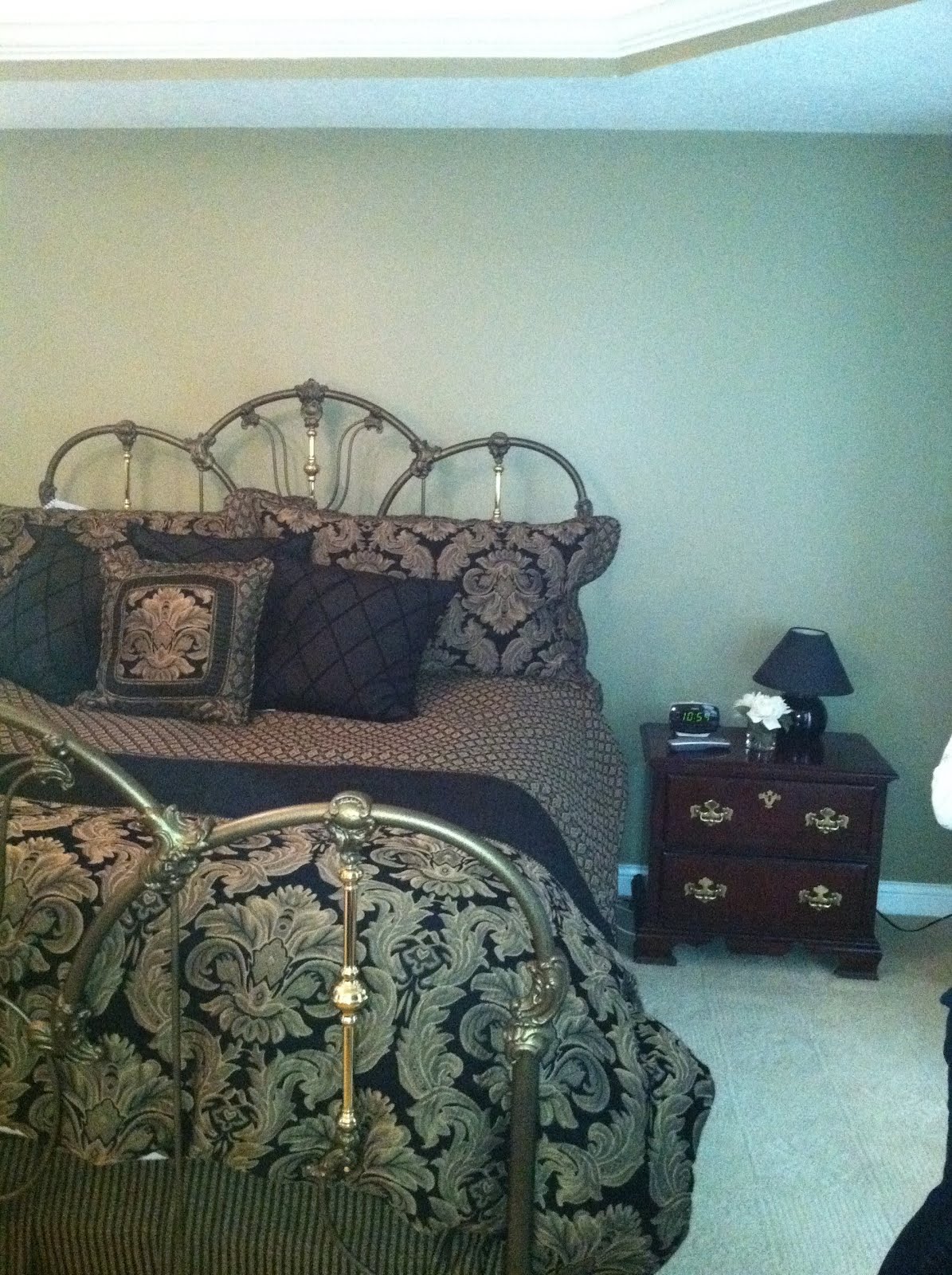

 After:
 We scaled back on the furniture. Smaller size night stands suit the clients storage needs and make the space feel larger.
  Hotel linens are a tried and true classic and work with almost any design style.
  This fabric was our starting point. My client and I both feel in love with it and planned the rest of the room around the curtains!
 The wonderful shape of the headboard is highlighted by the nailhead trim. I love the toughness it lends to the curvy shape.
  Mercury glass, silver, and natural finishes combine for a very tranquil look.
 The bolster pillow in the middle is the only new one in this collection. It came as a pair at HomeGoods. Nothing new, but just incase you're a styling newbie, HomeGoods is hands down one of the best sources for home accessories at affordable prices. I use pieces from here on every client project no matter the budget.
  When shopping at HomeGoods for a project, I always leave with
 All of the "things" you see on the coffee table (ie the candle sticks, vase, and natural elements like coral and barnacles) are from estate sales, hands down the best place to source one of a kind accessories practically for free.
  Another great trick: conceal your remotes when not in use in a decorative box (easy access and pretty all at the same time).